
Annukka “Nukka” Repo - Graphic designer / AD
“There’s nothing dedication, italo disco and cats can’t fix!”
Design process
Written on 04/2020
This board game has been a very long project, starting from late 2016 when I met Tuomas Mansikka for the first time. He had this grand idea of creating a board game with the theme of Kalevala, and he had been designing it for a while then. I introduced myself as a graphic designer freelancer and told him that if he ever needed help with the visuals, I would be glad to help!
Tuomas contacted me in the Summer of 2017 and we got to work. He showed me his PowerPoint slides that made use of CC0 images and his own drawings of how the game and its pieces, such as cards, would look like. During the Autumn we had countless Skype calls where I shared my screen, showing the layouts and vector illustrations I had come up with for the map.
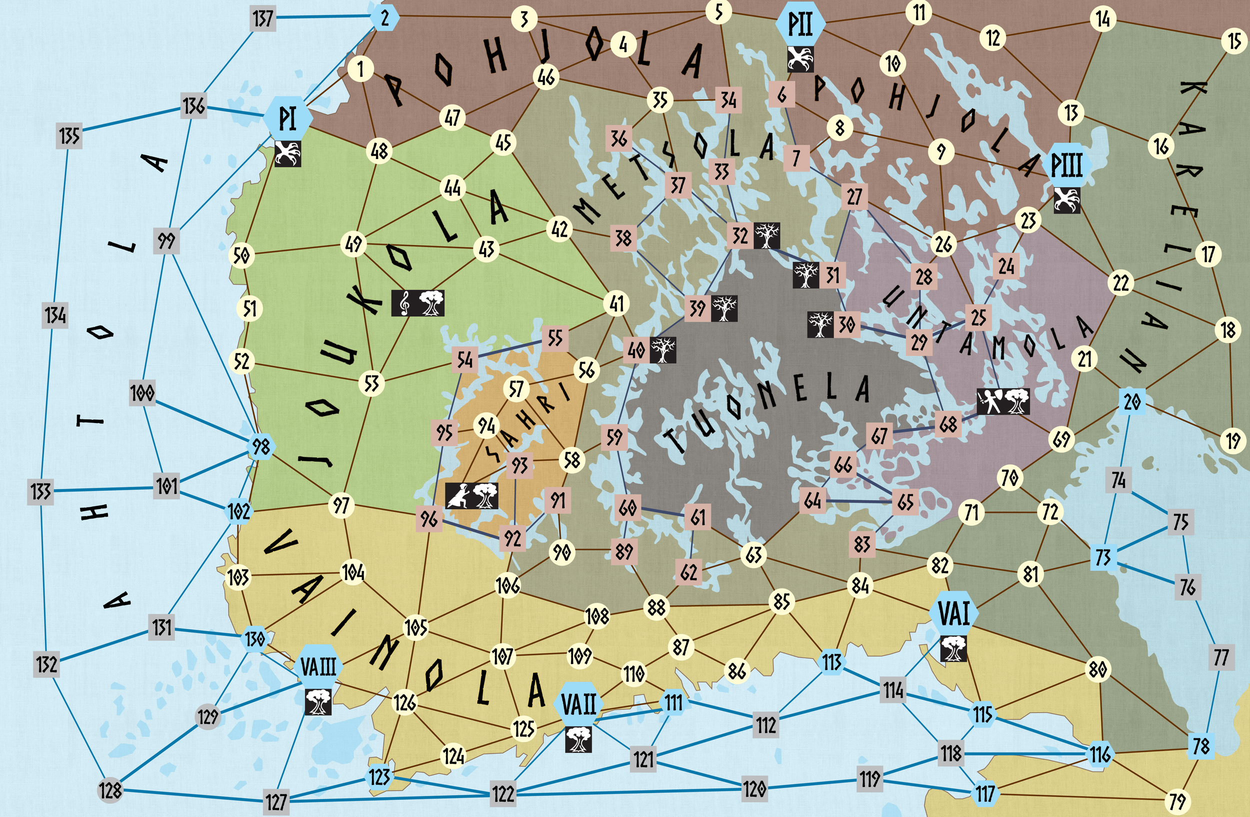
The map (A3) located the game in the Southern and Middle parts of Finland, with some Russian-Karealian areas too. The original idea was to coat the map with clear laminate coating, to allow the players to draw their character's paths with erasable markers.
The cards were dealt

We wanted to bring some natural elements to the visuals of the cards, and as we needed Red, Yellow and Silver for the main colours, we chose to use the red bark of a pine tree, yellow Autumn leaves and the black-and-white bark of the birch tree, called Tuohi, as the background imagery. The icons were downloaded from a free-to-use online service called Game-Icons.net, and the typeface was also a free typeface called Norse, designed by Joël Carrouché.
Several times Tuomas and I ran into the problem of having long pieces of text and limited space to place them. The typeface, as a display font, works best for headlines, and thus we had to look for a better alternative for our needs. We found that Segoe worked pretty well as an established typeface for body copy so we changed the longer pieces of text to that to make the cards more legible.
For the turn side of the cards, we used icons of Claws, a Tree and a Farmer, and for textures, I created a fabric knitting texture and explored with pale linen to bring more authenticity to the visuals. As for the Tale cards that have genuine Kalevala poems or runes on them, I designed a more Celtic style knot design as a frame for the texts. The same frame ran around all our print products, such as the Rule book.


The high point of that Autumn was when Tuomas visited the renowned Game Expo in Essen, Germany. There, without a rent table to show the game setup, he managed to gain the interest of a few publishing companies. Their feedback mainly focused on the map, and how it needed some love. It is true that the game map holds the most vital visuals of a game and thus its success, so we decided that we needed an actual illustrator to work on the map.
At this point, I realized that I didn't want to go forward with the path we'd been tracking on. The visual style looked more like the ones of Vikings and Celtic runes than the Finnish Kalevala I had accustomed myself to during the years. To me, Kalevala's visuals had to have more of a Jugendstil look, as the craze for Kalevala in Finland was in its heyday at the turn of the 1800s to 1900s. During this time, the most well-known Finnish artists called Akseli-Gallen Kallela and Hugo Simberg were inspired by the stories and songs compiled into a book by Elias Lönnrot in 1849. This book was called Kalevala, and it became the epitome of Finnish mythology, saving the stories long told and sung by the folks that had lived around the land.
In Spring 2018 I and Tuomas applied for several different Finnish art and culture grants to get funding for our growing project. I'm a member of both Grafia ry and FOT ry Freelance-graafikot, so we also applied for their grants that are aimed at supporting the working and production costs of creative projects. By the middle of Summer, we received the joyful information that our applications had been accepted by both and that we could carry on with the project!
I spent many weeks of that Summer in Tampere city's Metso library taking photos and making notes on any Kalevala related literature from old poem books to children’s books, to get the hang of how Kalevala has been depicted over the years. At times I felt self-conscious, as I was borrowing old books just for the images in them or on their covers and backs!
I also walked around downtown Tampere and took a trip to Helsinki to take photos of the Jugendstil architecture and especially the National Museum of Finland. There is a ceiling dome in the main entrance hall, that is painted by Akseli Gallen-Kallela, with elaborate depictions of some of the main Kalevala lore events.
The troubled waters
From August 2018 foward we were looking for an illustrator to help with the project. At the same time a gaming lounge / bar opened in Tampere with the most nostalgic NES- and SNES- and arcade games known to humankind! In that bar artists could have their art showcased on the walls as a sales exhibition. At the time, the art was mainly my own pixel-game themed framed art (ad), and from a very talented illustrator called Heikki Harmainen, who we at the time, knew nothing about.
Around the same time, Tuomas found a game artist / LARP enthusiast called Mikko from Jyväskylä, so we decided to meet with him. He invited us to his home and we played the game to understand the story, and to get the creative minds rolling with ideas for the game's visual development. After the very promising meeting, me and Tuomas thought that this would turn out to be a very fruitful collaboration and so we invited Mikko to our online chat rooms and shared some file sharing folders with him. Then he disappeared without a trace.
Me and Tuomas tried to call and email him several times, as he'd left us with the impression that he wanted to invest his off-time from his paid work in to our project, but all attempts turned out futile. We even called his work colleagues, who promised to make him call back to us as soon as possible. This, however never happened, so after some time, we both decided to kick him off the team, and sent him a resignation letter informing this to him.
The rescue mission
After this turn of events, we were more disappointed in ourselves, but as everyone knows, failure is instructive, so we decided to give it another go. Then I remembered the illustrations from the bar and asked Tuomas what he thought of Heikki's art style, and if that would fit our needs. We decided to meet with Heikki at a café in Tampere on a warm sunny day in May 2019 and the rest is history! Heikki immediately understood our concept and surprisingly enough, he had always been interested in Finnish and Nordic mythology and got very excited about being part of the Kalewala: Tale of Sampo board game. Read his thoughts on the project here.
With Heikki's help, the game map was finished and he also gave his artistic touch to my vector art pieces such as Sampo and Boat token.
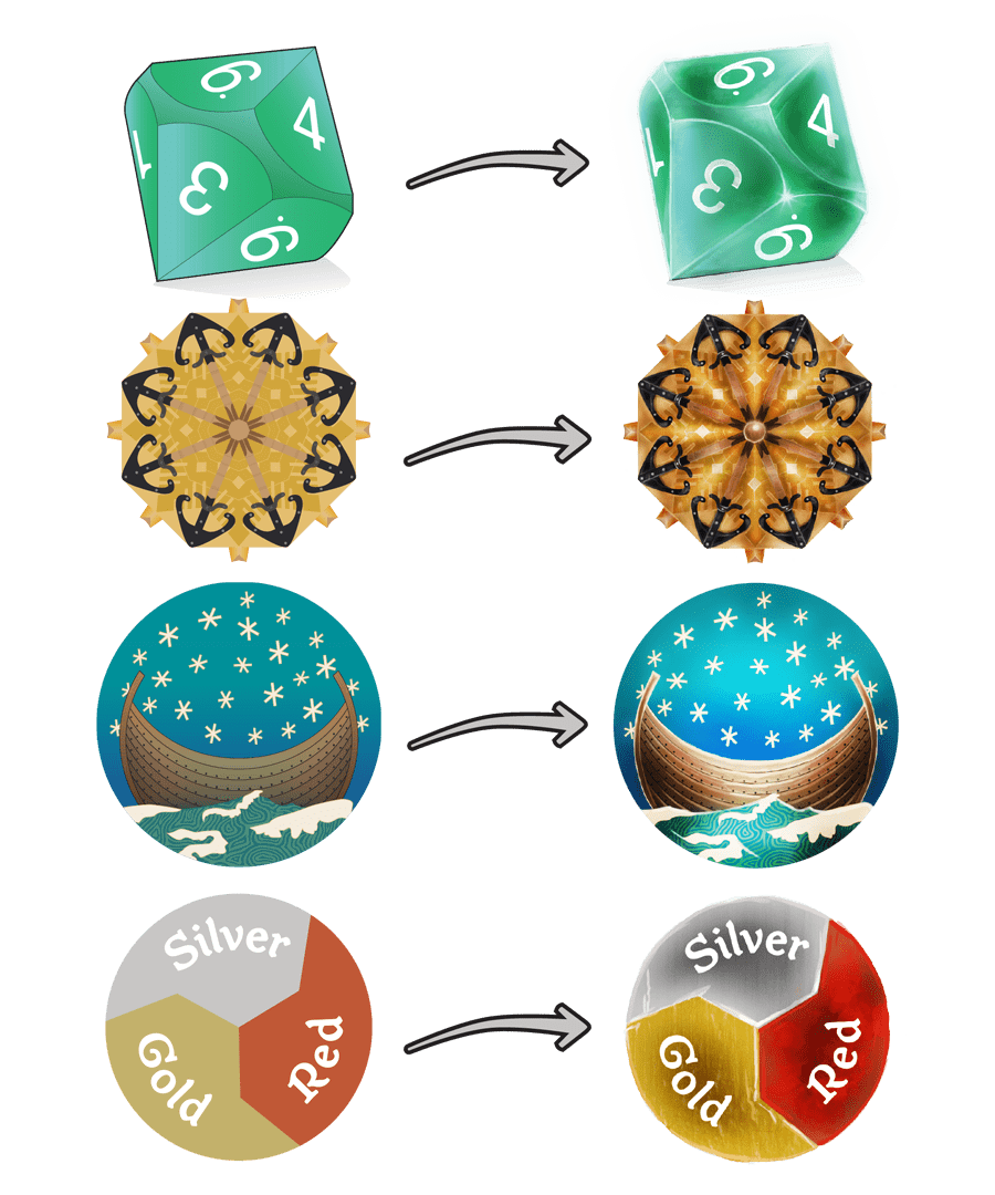
Some of you might notice the resemblance of the Boat token's starry sky and wavy waters with the famous Sammon Ryöstö painting, and you would be correct! I also took visual cues on how the Sampo would look like from the same painting, not to forget the Don Rosa's Donald Duck version eiher from the cover of Sammon Salaisuus (The Quest for Kalevala, Egmont, 1999).
In the meantime of finding an illustrator to help us out, I had designed new cards for us and with them I created the final frame ribbons that would be utilized throughout the game pieces, box and print booklets.
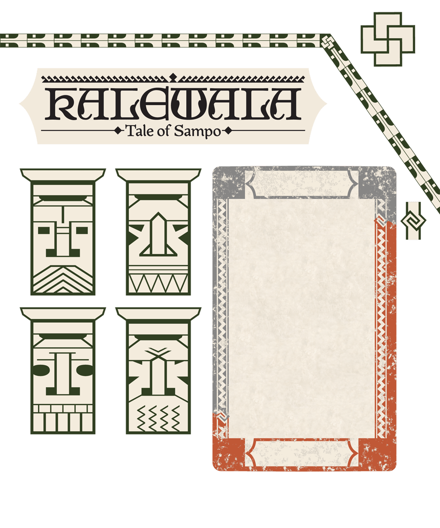
In the image above you can see an array of different frames and ribbons I designed for the game's visual look: the big knot in the upper right corner is called "Tursaan sydän" (the heart of a Tursas, sea monster) which is considered in the Karelian folklore as a protective symbol, and was carved on door frames to protect and bring luck to the household.
The head figures in each corner as well as the two-part green ribbon are direct finds from the National Museum of Finland's main hall's ceiling dome's top cylinder with the ceiling window.
The twirly-frame end on the right of the two-colour card is the "Runonlaulajan kädet" symbol (Poem singer's hands) that is the official icon from Kalevala seura's logo (Kalevala Society Foundation). The Kalevala poems were sung originally together in duos, by sitting opposite of each other and holding hands as the symbol depicts.
The game box has a picture of Käärmesolki (The snake buckle) that is based on a genuine Kalevala Koru bronze jewellery found in excavations fröm Öland, Gotland and Western Finland.

The cards and the map needed a lot of symbols that all had to be visible in small sizes and different colours (red, yellow, silver, black) and also have enough details to keep the player interested. See some of them in the above picture; not all of them were used in the game.
About the typeface
Previously I mentioned about the typography of the game, and how the free typeface North wasn't the right fit for this game after all. I searched far and wide, looking for a Jugendstil typeface, preferably from a Finnish typedesigner, that would give the right visual wibes. And finally, Google blessed me by showing me the results of Aalto University graduate's Master Theses from 2009. There it stood, Joukahainen typeface from Teemu Heinilehto. He had reserached Akseli Gallen-Kallela's works and writings, especially the Suur-Kalevala (The Great Kalevala) that Akseli Gallen-Kallela had planned to publish in 1935 which was the centennial of Kalevala (1835), as a gift for the people of Finland. Sadly, Akseli died of pneunomia in 1931, and his son Jorma took over his work for a little while. For more information about Akseli Gallen-Kallela's life, visit his home museum near Helsinki. And to read more about the Suur-Kalevala, read this article on Finland.fi here.
I mustered up some courage and called mr Heinilehto in Autumn 2018. I introduced myself and our project and after the call, sent him an email with the a project plan and links to my webpage with the latest game piece visuals at the time. Looking back, the game has come a long way, haha!
Heinilehto got intrested in our project and sold me the licence to use his Joukahainen typeface with the condition that the typeface could never leave my computer and all instances of the typeface had to be vectorized as images, to prevent the spread of the unfinished work, as he called it.
I agreed to the terms and have kept him up to date about the progress of the game ever since via emails :)
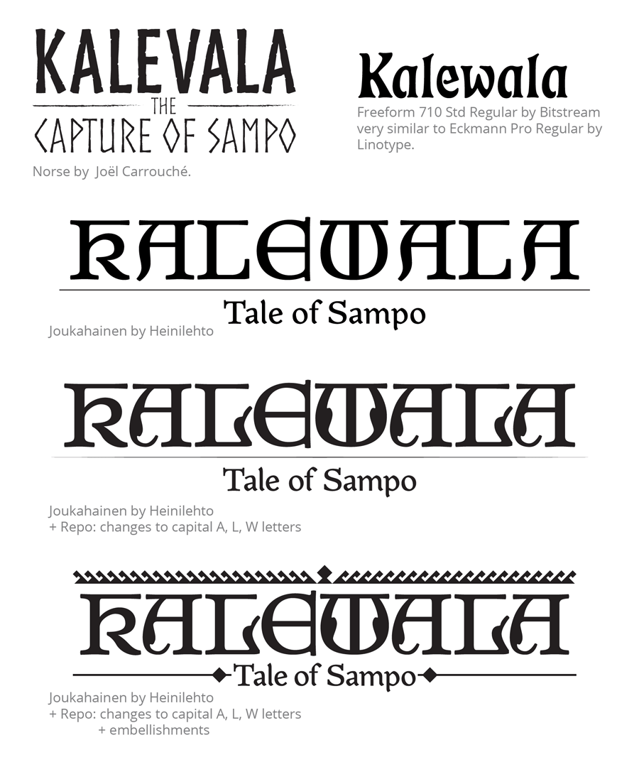
Above you see the development progress of the logo. From Norse to FreeForm 710 (that turned out be a Bitform's version of Linotype foundry's Eckmann Pro Regular typeface), to Joukahainen with my little tweaks to the capital letters (blessed by Heinilehto) and the embellishments. The inspiration to those I got from an iron gate I found in Tampere.
In case I sparked your interest in graphic design, feel free to send me a line by email or follow my freelance social media channels from links below :)
I'm happy to elaborate on my profession and help you out, were you a graphic design student, colleague or just an interested one!